Brand Identity Development for Network Circle
Fusion Impact partnered with Network Circle, a company known for organising high-level networking events for European C-Level leaders, to revamp their brand identity and corporate design. This collaboration resulted in a comprehensive branding book, a strategic social media plan, striking digital and print graphics, and a user-friendly, responsive website integrated with their Salesforce CMS.
The Brief
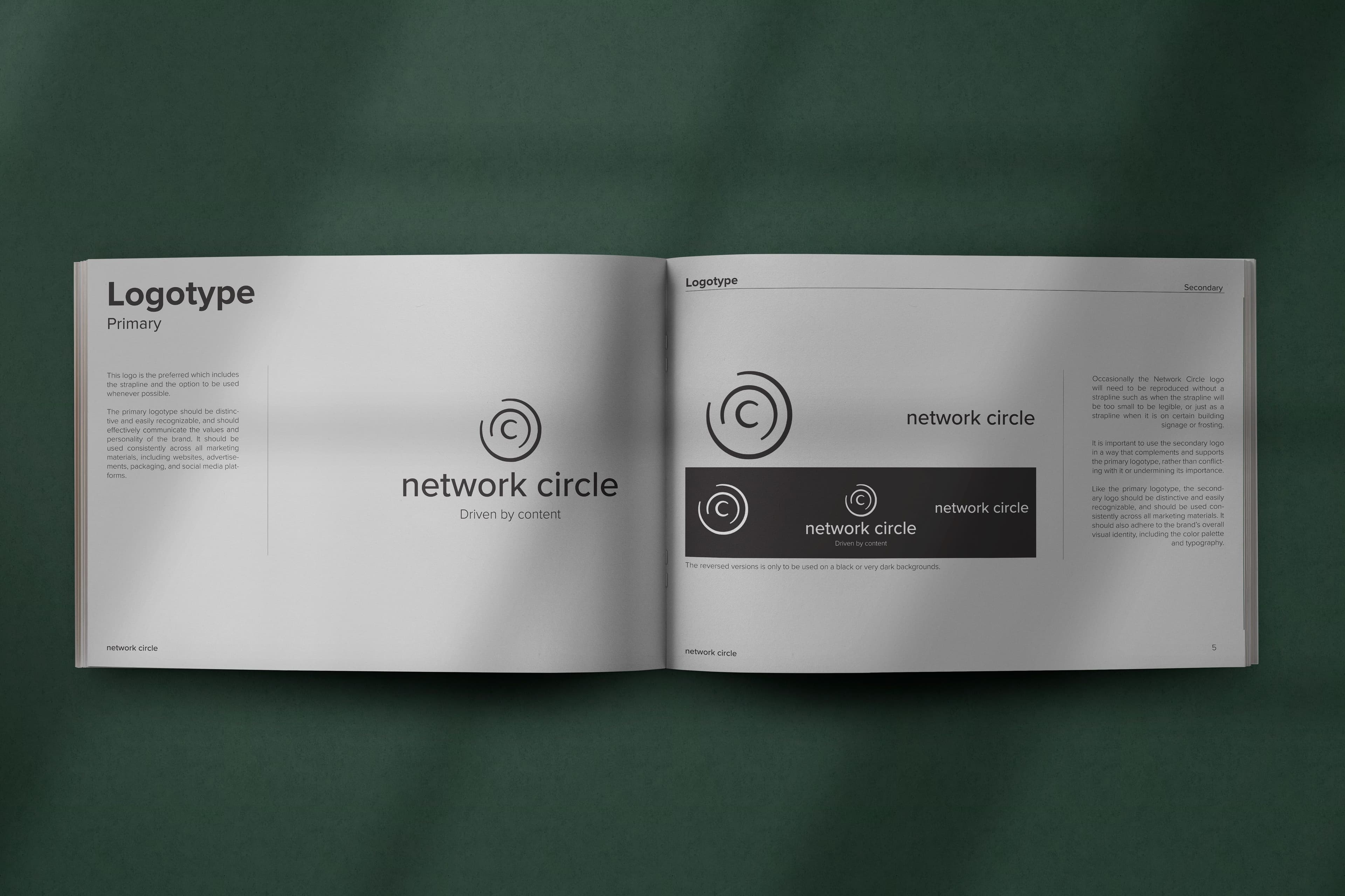
The project brief was quite simple: Create a new brand identity that communicates the right message to the right target group. So, for Network Circle, a provider of high-class networking events for C-Level executives in Germany, we needed an approach that will show the professional and straight forward business manner of the events while simultaneously be modern and attractive, communicating the company's striving towards innovation and digitalization. The expected output was clearly defined as a comprehensive branding book that can be handed over to employees and other stakeholders and that clearly shows which colors to use, how to use the logo in which places, what to do and what not to do with the logo, how to lay out social media posts, and what font families to use.

Our Approach
For this project, our first step was (obviously) to do some observations: How does the company operate? With what types of personality are we dealing company-wise but also client-wise? What does their way of doing business feel like?
Then, we looked at what we already have: We have a logo in a classy-chic font style, we have some corporate colors, and we also have a group of typefaces that we see repeatedly. Rolling up our sleeves, we started with the colors. Because we got a quite clear impression of the mood, atmosphere and context we need to communicate, starting with the colors to transport emotions properly was the way to go for us. We came up with a set of colors that keep the traditional business-professional atmosphere and touch the innovative digital-first approach with well set accents and shades. After we collected a color palette that fitted the concept, we went over to the typeface. We needed a typeface that harmonizes with the colors, the concept, and the clients. Clearly, we wanted to move away from the strongly used serif font, going over into a sans-serif typeface that still has the same amount of professionalism. Check - as last point, we went for the logo. Why not earlier? Because of two reasons:
Firstly, a logo remake is always dangerous - you need to create something new that people will still recognize as the new version of something that they know and trust. Secondly, in this case, the logo consisted of a wordmark, combined with a logomark. Therefore, we only changed the wordmark to the new font face and made their logomark thinner and more geometric. The simple eye would not notice a difference but seen in comparison and together with the rest of the brand identity, one clearly sees an improvement in harmony and brand alignment.

What about online?
Correct - what would a new brand identity be without taking the work over to the online representation of the company? Therefore, we completely re-designed the Network Circle website.
For the website, we had a simple thought in mind when getting started: How do we make someone understand what this company does within 5 seconds after opening the page? So, our goal for the website was to make it as simple as possible for visitors to immediately get what the company does. At the same time, we needed to take over the new brand identity we just developed, transporting the feeling of business, professional, and modern into the digital world.
The result is exactly that: We set a clear statement directly upon opening the website, explaining in detail what happens here. Browsing deeper will reveal more insights into the concept, the events, for whom it is made, and the overall way of working of Network Circle. All aligned to their brand colors, typefaces, and everything else defined in the brand guideline book.

The Summary
Our partnership with Network Circle exemplifies the essence of collaboration and transformation. Their trust in our expertise and vision allowed us to deliver results that surpassed expectations. The redesigned brand identity, complemented by a compelling social media presence, captivating graphic designs, and a cutting-edge website, sets them on a trajectory of success.
We are very proud of the work we've accomplished together with Network Circle. This project is a testament to the power of innovative design, strategic thinking, and a shared commitment to excellence.If you are seeking a creative and dedicated team to help redefine your brand, look no further. Contact us and let's embark on an extraordinary journey to elevate your business to unparalleled heights.
Learn more
